
Commercial new construction of the Jacksonville State University Fitness Center in Jacksonville Alabama, photographed for Turner Construction and Moody Nolan Architecture by Birmingham Alabama based architectural and interiors photographer, Tommy Daspit.
Read Morecommercial photography
Office Environments - Birmingham AL Commercial Interiors Photography /
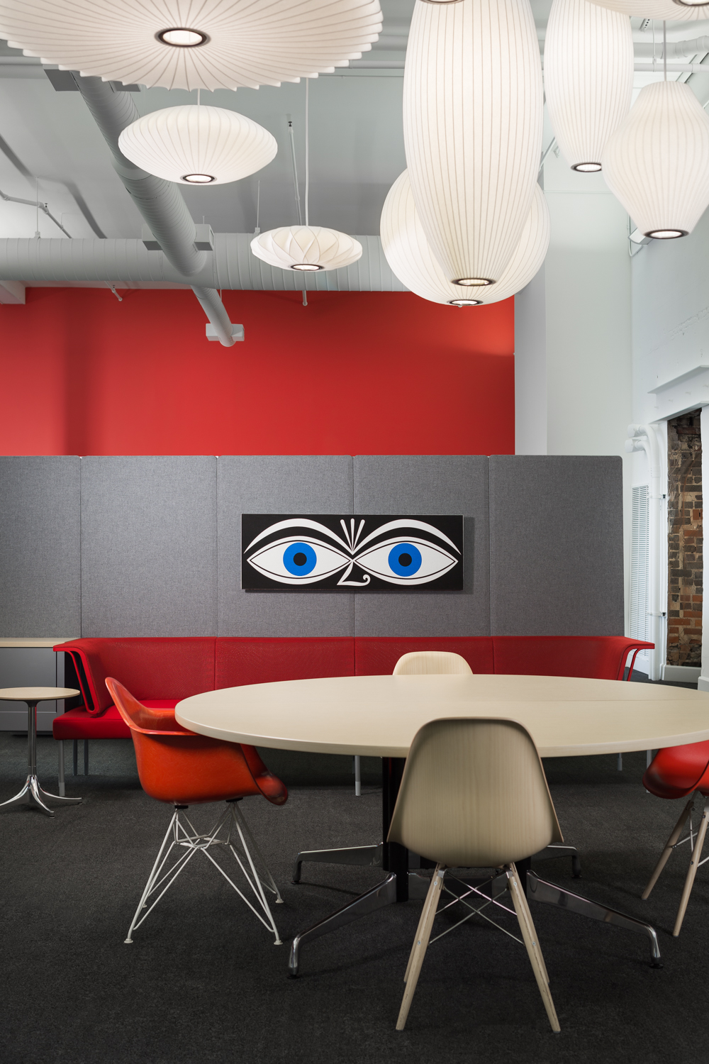
Click on image to view larger - Conference room at Office Environments in Birmingham. This shot was particularly difficult due to the large windows and all the reflections in them. I utilized several techniques to control them. The final image is a combination of multiple ambient and strobe exposures.
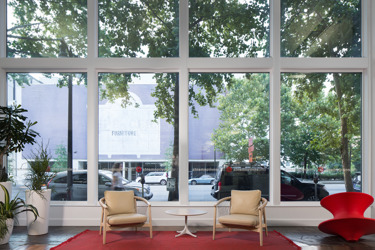
I recently photographed the newly remodeled showroom of Office Environments in downtown Birmingham. This is a shoot that I’ve been looking forward to working on and showing off for some time. When I first saw the remodel late last year I knew it was a project I wanted to capture. My residential portfolio is quite extensive but my commercial work is more limited. This is especially true for interiors. Fortunately for me one of Office Environment’s reps is in my BNI (Business Networking International), and we were able to work out a deal!
I really loved every aspect of this space. It’s in a historic downtown building and showcases some of the very best in modern office furniture design. As a Herman Miller dealer everything is top notch quality and style. It was my job to capture the feeling of this showroom and business in photographic form. These images would be used by Office Environments on their website, social media, marketing materials and advertisements. These images will represent them to potential clients and partners. I needed to make sure they captured the quality of not only the furniture, but Office Environments, and the great people that work there as well.
This was to be a little different as well because we did the shoot at night after they closed. This gave me a great opportunity to have some images with a very different look from the rest of my portfolio. Most images I create are done with a mixture of sun and ambient light. Night images take out the sun variable but add a new layer of complexity. There’s much more heavy lifting to be done by the strobes and I had to be careful not to make the images look too “flashy”. The resulting images are a blend of multiple shots blended together. Some are as few as three all the way up to the office overview which is about twenty.
In the end with a lot of help from my assistant Crys and Blake Stringer from Office Environments we were able to pull it off!


Click Thumbnail to view larger images.
See more of my commercial interiors portfolio.
Gabby Home Veranda Magazine AD Shoot /
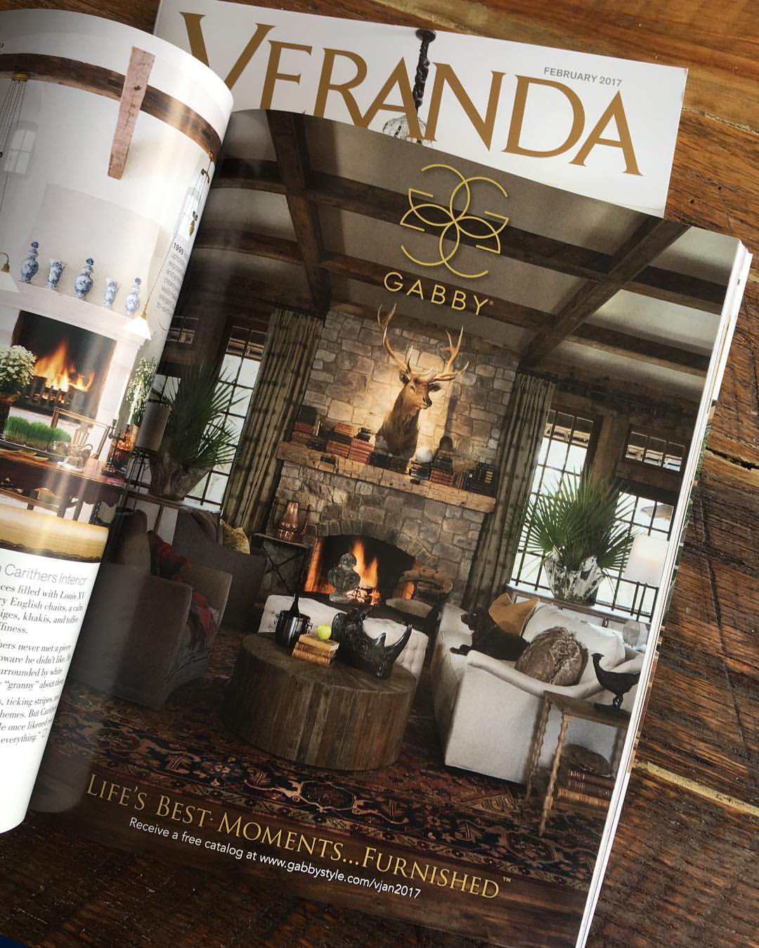
The finished product in the February 2017 Issue of Veranda Magazine.
I’ve been pretty behind on my blogging. Last year was one of my best years as a photographer and this year has gotten off to a pretty good start. As a result, I haven’t had very much in the way of free time. Between shooing, meetings, and editing there hasn’t been a lot of room for other things. However, I have made this blog a priority. In the coming weeks I’ll actually be expanding it’s role from just one of showcasing recent projects, to being a resource of trends, personalities, and insight for the area’s residential and commercial scene. So, if that’s something of interest to you, and I hope it is, be sure to hit the subscribe button, to get automatic updates!
As for this post, it’s really long over due!
Last year I got a call from Gabby Home (the indoor premium furniture line from Summer Classics). They were putting a full page ad together for Veranda Magazine and needed it shot on short notice. Of course I was happy to help out! The location was the hunting cabin for Summer Classic’s CEO, Bew White. Chris Hutchens, the amazingly talented creative director at Gabby, ran the shoot. It was the second time I did a location shoot with him so I already knew this was going to be a good one. The results certainly didn’t disappoint! We spent nearly the entire day taking out the existing furnishings and brining in new furniture, accents, a mounted elk head, and even multiple dogs. Every aspect of the shot from staging, to lighting, and composition were scrutinized and thought through. This was for a full page ad in Veranda Magazine, one of the premier home design publications in the country. It was an expensive ad and it had to be attention grabbing to make a return on that investment. I appreciated the trust placed by Chris and the entire Gabby team in me to execute their vision. The finished product came out in the February 2017 issue. Take a look and let me know, did we accomplish our goals?
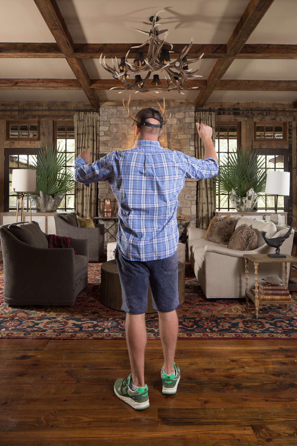
I had a little fun with Chris as he was orchestrating the shot!

Final image. Space was left at the top and bottom to accommodate the logo and copy. This final image is a composite of 8 individual images 14 total layers in Photoshop for a 1.2GB file!
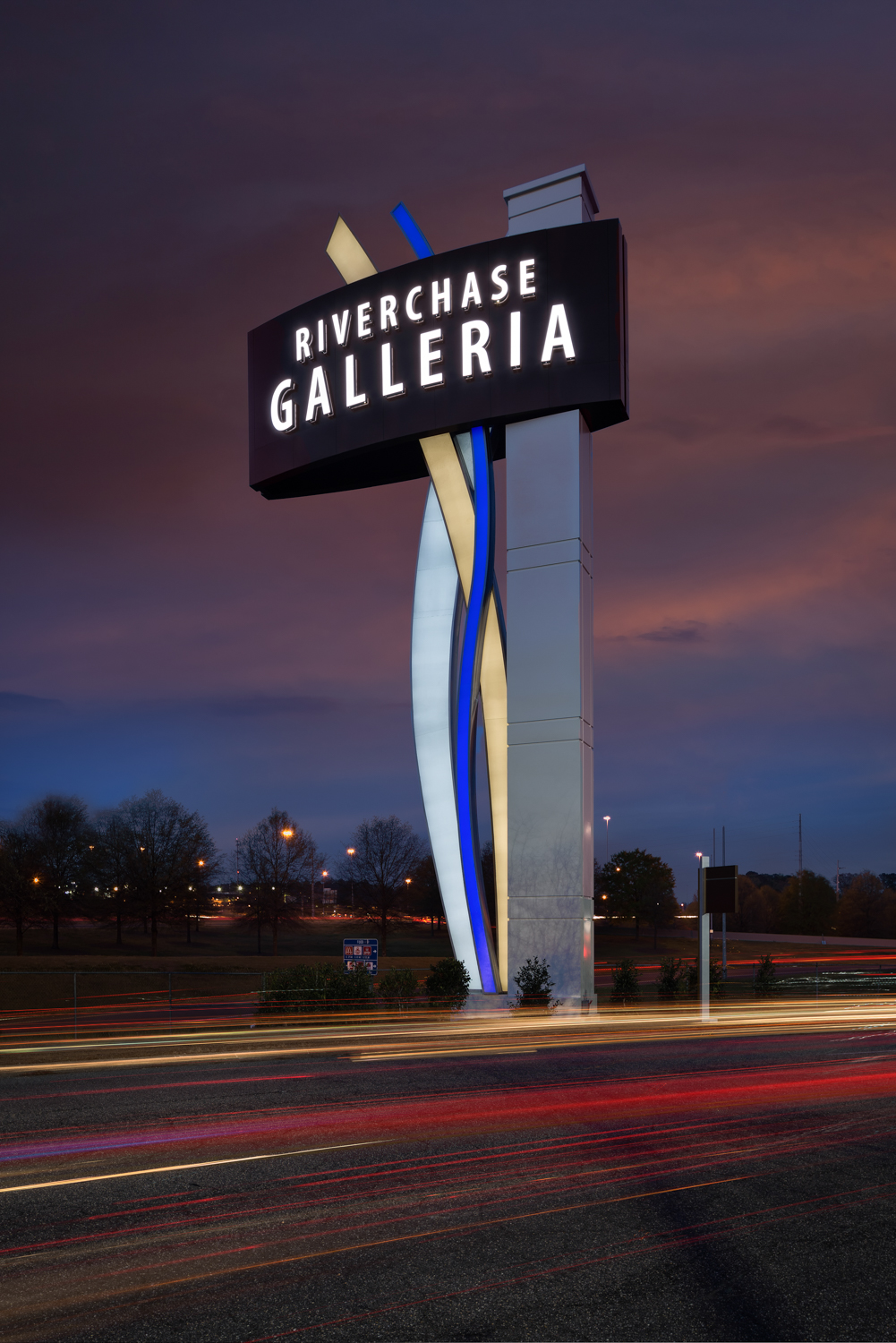
Galleria Signs - Hoover, AL Architectural Photographer /

One of the things I love about being an architectural commercial photographer is the variety of projects I get to work on. It could be a kitchen for a remodeler one day and an apartment complex for a real estate developer the next. In this case I was contacted by Integrated Sign and Graphic in Lexington, Kentucky. They designed, built, and installed the new signs at the Riverchase Galleria Mall in Hoover. Daytime and twilight images of the exterior signs were needed. These photos would be used to showcase their work, to illustrate to potential clients what their capabilities were. It was my job to make sure that was done with the highest quality possible.
The mall is absolutely huge. There are many, many signs all around the property. Some face east, some west, some north, and some south. I had to plan my shots around the best time of day to get the best light on each sign. When it came to the night shots the window of opportunity for the best light with the illumination of the sign was very short. I had to make sure everything went right the first time as I could only do a maximum of two signs in an evening (it took two trips to get the ones they wanted).
I also try to include elements in the environment that give the viewer a sense of the space and life going around the subject. To make that possible I included the cars going by the signs in both the day and nighttime images. I used slow shutter speeds to capture the movement and presence of the vehicles without taking away focus on the subject. This way the potential client has a better understanding of how the public sees and interacts with the sign. After all that’s what they are ultimately for. If it can’t get the attention of the public passing by then it’s of no benefit to the business that paid for it.
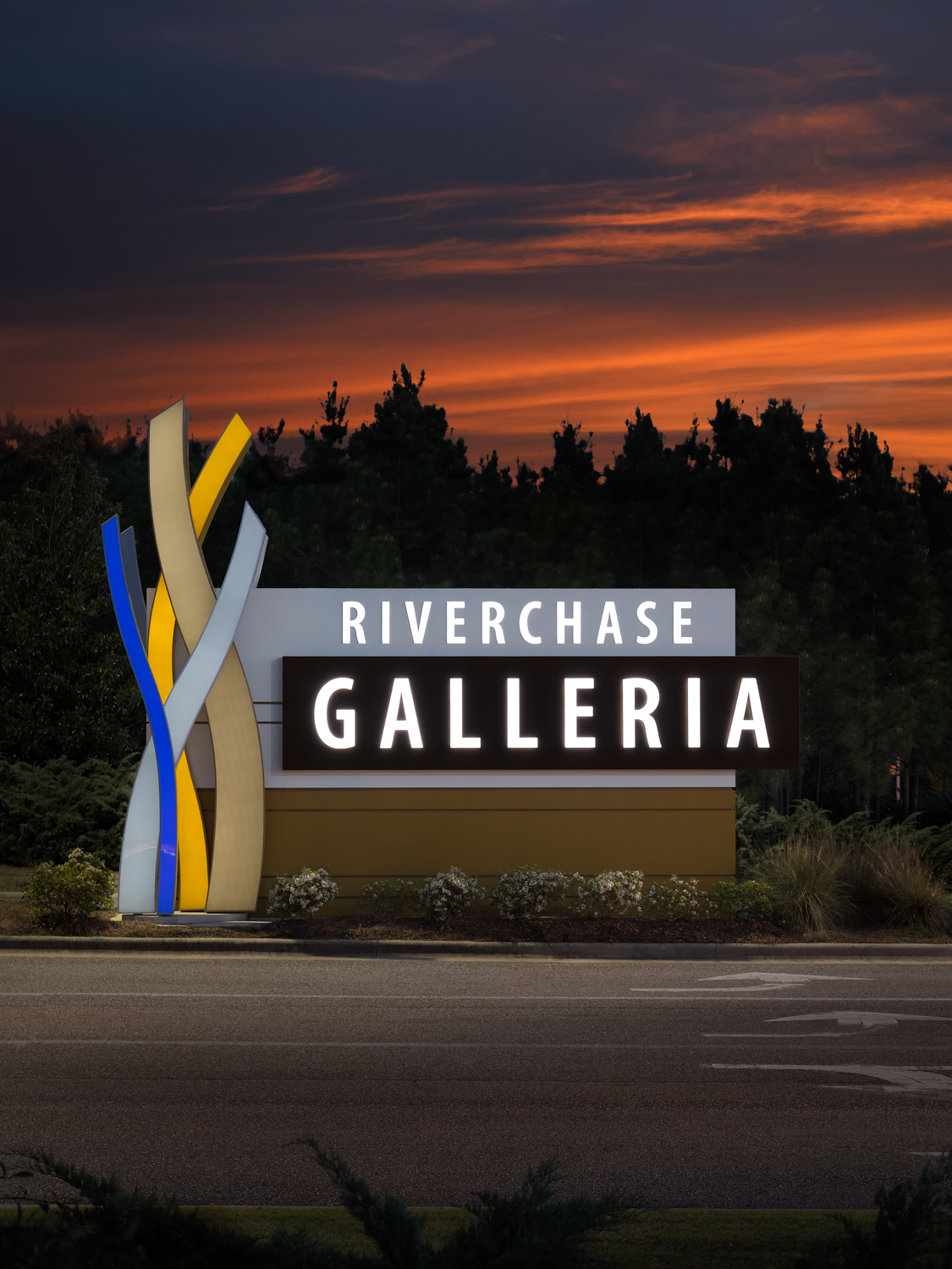
Drag the sliding line to see the difference with and without the lights from the cars in the image.
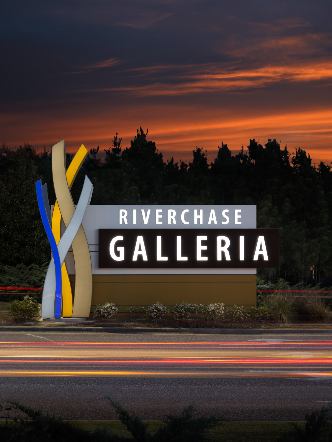
By including the intersection and the lights of the cars passing by, I'm able to give Integrated Sign's potential clients a better sense of the signs placement in the environment as well as the amount of traffic seeing that sign. A photo of just the sign would be perfectly fine. However, including energy, motion, and context gives the image more life and allows the end viewer to connect to the subject in a more meaningful way. This is one example of how I go above and beyond to serve the needs of my clients.
While a simple static shot of the sign by itself would have satisfied the basic needs of my client it wouldn’t have been the best use of their resources. By considering my clients end needs and purpose for the images I’m able to better create images that tell their story. Ultimately that is my job. I create images for my clients that are compelling and show their potential customers what they can do for them. I help my clients grow their businesses. I take as much pride in this as I do in creating the images that bear my name and my reputation. Take a look at the images below and tell me in the comments if you think I accomplished that mission.
click on thumbnail to view larger image


To see more of my commercial architectural photography see my commercial exteriors and commercial interiors portfolios.
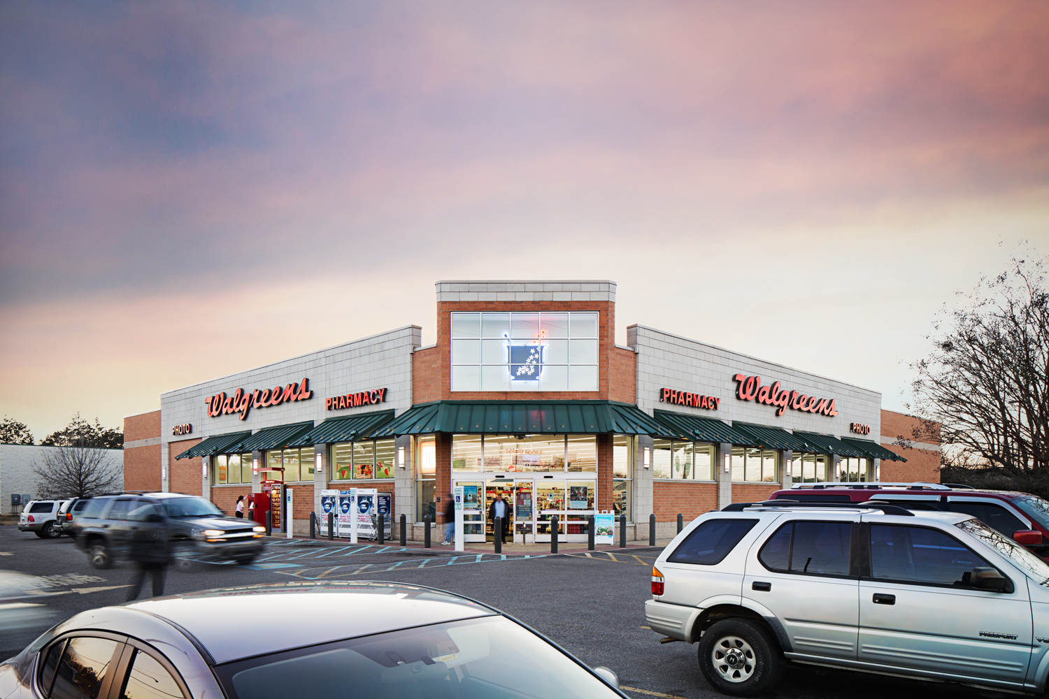
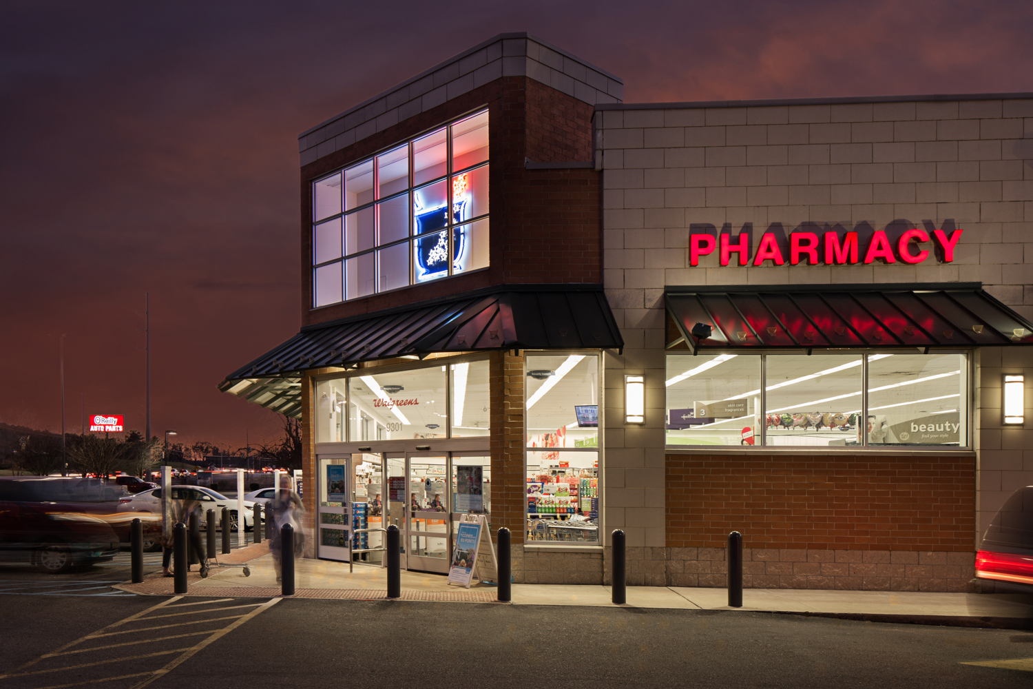
Walgreens - Birmingham AL Commercial Photographer /
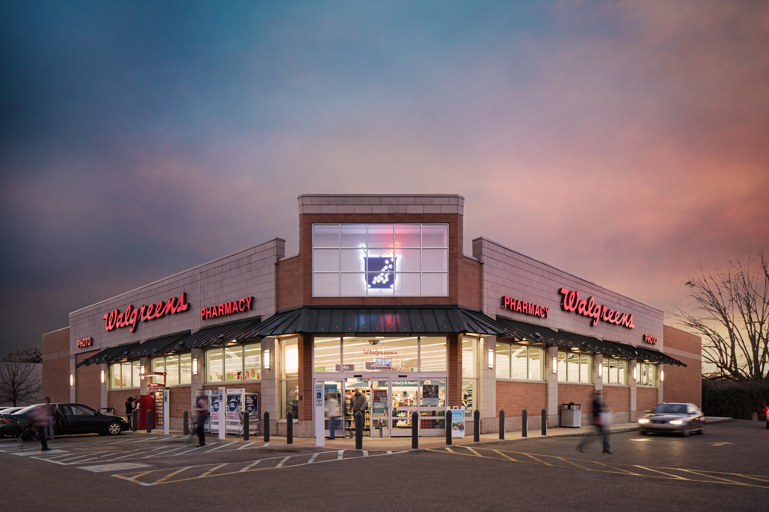
A couple of weeks ago I was contacted by a commercial real estate firm out of New York. They needed photos of a Walgreens in Alabaster. The images needed to be colorful, eye catching, and at the same time, demonstrate the customer traffic of this location. Of course I was up for the challenge!
I started the shoot in what photographers call the “golden hour”. This is the hour just before sunset and just after sunrise each day. So long as it’s not overcast this is often considered to be the best time of day for photography. The light is “warm”, hence the golden hour name, and the angle of the light is good for nice shadows and contrast. I continued taking multiple exposures as the light changed over the next hour and a half.
One of the challenges was to show the customers coming in and out of the store and cars in the parking lot. This is especially tricky when you’re not using models, but rather normal people going about their lives. If they’re recognizable in the image, and you’re using it for advertising, then you have to have them sign a model release form. This isn’t something we wanted to deal with so a technical solution was needed. I could just blur them in Photoshop but you end up with a photo that looks like it was shot by 60 minutes interviewing a mob informant. Not a good look. Instead, I set the camera to have long shutter speeds. This still showed people and cars there but they were motion blurred. This has the benefit of not only hiding their identity but also conveying motion and energy of the space.
The final images were actually a composite of many photos. I overlayed people and cars from multiple images to create the final vision. The sky was added from a library of skies to fit every possible lighting situation (if you wait for the sky to be perfect as you shoot the project you will be doing a LOT of waiting).
The end result was an image that showed the details of the building, customers patronizing the business, and colors that grab the viewer’s attention. I was able to check off all the boxes my client needed and they were thrilled with the results. Amazing commercial real estate photos aren’t taken, they are created.
click on thumbnail to view larger image


See more of my commercial real estate photography for Birmingham AL